About the Starbucks logo
Did you know…?
The team agreed that the name Starbucks evoked the romance of the high seas and the seafaring tradition of the early coffee traders.
The Starbucks logo is an image of a “twin-tailed siren”
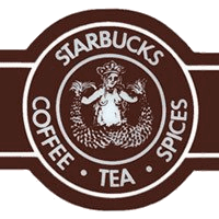
In the first version, which was based on a 16th-century “Norse” woodcut, the Starbucks siren was topless and had a fully visible double fish tail.
In the second version, her breasts were covered by her flowing hair, but her navel was still visible. The primary color was changed from brown to green. In the third version, her navel and breasts are not visible at all, and only vestiges remain of the fish tails.
The logo was altered when Starbucks entered the Saudi Arabian market in 2000 to remove the siren, leaving only her crown
In January 2011, Starbucks announced that they would make small changes to the company’s logo, removing the Starbucks wordmark around the siren, enlarging the siren image, and making it green.
 Today, with more than 15,000 stores in 50 countries, Starbucks is the premier roaster and retailer of specialty coffee in the world.
Sources:
http://www.starbucks.com/about-us/our-heritage
http://en.wikipedia.org/wiki/Starbucks#Logo


